Building a bolder campaign identity for ARK & ADE
Building a bolder
campaign identity
for ARK & ADE
Building a bolder
campaign identity for ARK & ADE
Overview
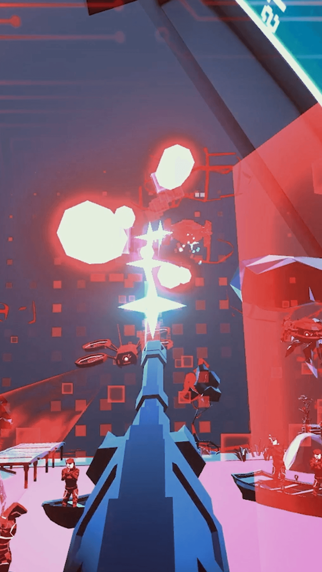
Ark & Ade is a fast VR arcade shooter built around neon environments, oversized weapons, enemy waves and over-the-top 80s action references. My role was to help turn that energy into a sharper campaign identity across logo, key art, trailers, store assets and social communication
Role
Art Direction, logo direction, key art briefing,
campaign concept, marketing assets
Focus
Brand identity, logo direction, key art direction, campaign tone, store and trailer assets
Output
Logo system, key art brief, campaign concept, trailer direction support, store assets, social media visual direction
The challenge: making a small game feel loud
The challenge:
Making a small
game feel loud
The challenge:
Making a small game feel loud
Ark & Ade already had a strong core: fast VR shooting, neon arcade environments, oversized weapons and over-the-top 80s action references. The challenge was to turn that energy into a louder and more ownable campaign identity.
Rather than positioning the game as just another retro-inspired VR title, the goal was to help Castello Inc. speak with more confidence: honest, funny, direct and unapologetic. Proud of what the game was, sharp enough to stand out, and loud enough to carry across logo, key art, trailers, store assets and social communication.
The game was originally called ArkAde, and much of the early logo and identity work was built around that name. When the title later had to change to Ark & Ade, the logo needed to be reworked around an ampersand without losing the arcade-futurist attitude, speed and readability of the original direction.
Ark & Ade already had a strong core: fast VR shooting, neon arcade environments, oversized weapons and over-the-top 80s action references.
The challenge was to turn that energy into a louder and more ownable campaign identity.
Rather than positioning the game as just another retro-inspired VR title, the goal was to help Castello Inc. speak with more confidence: honest, funny, direct and unapologetic. Proud of what the game was, sharp enough to stand out, and loud enough to carry across logo, key art, trailers, store assets and social communication.
The game was originally called ArkAde, and much of the early logo and identity work was built around that name. When the title later had to change to Ark & Ade, the logo needed to be reworked around an ampersand without losing the arcade-futurist attitude, speed and readability of the original direction.
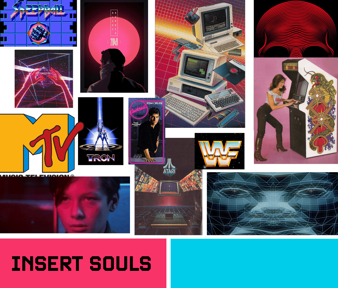
Moodboard
The direction: 80's Action not just nostalgia
The direction: 80's Action not just nostalgia
The direction:
80's Action not just nostalgia
Ark & Ade needed to feel inspired by the 80s without being trapped in nostalgia. The direction was to lean into arcade-futurism, neon sci-fi, oversized action, humour and confidence rather than simply calling the game “retro.”
The brand voice was built to feel direct, playful and unapologetic. It should sound like an indie studio proud of its game, not one trying to make itself smaller. The visual identity needed to match that attitude: bold shapes, high contrast, strong silhouettes and a sense of speed.
This direction became the foundation for the logo, key art, trailer tone and campaign assets. Everything needed to feel like it belonged to the same loud arcade-action world.
Ark & Ade needed to feel inspired by the 80s without being trapped in nostalgia. The direction was to lean into arcade-futurism, neon sci-fi, oversized action, humour and confidence rather than simply calling the game “retro.”
The brand voice was built to feel direct, playful and unapologetic.
It should sound like an indie studio proud of its game, not one trying to make itself smaller. The visual identity needed to match that attitude: bold shapes, high contrast, strong silhouettes and a sense of speed.
This direction became the foundation for the logo, key art, trailer tone and campaign assets. Everything needed to feel like it belonged to the same loud arcade-action world.
Solving the ampersand problem
Solving the ampersand problem
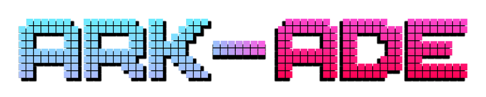
The original logo leaned into a pixel-based arcade look, which made sense for the game, but it created challenges around readability, distinctiveness and marketing impact. I redesigned the logo to feel sharper, faster and more ownable, with a stronger arcade-futurist attitude built for marketing use across stores, trailers and campaign assets.
Later in the process, the title changed from ArkAde to Ark & Ade. That created a new design problem: the ampersand could not feel like a symbol simply inserted into an existing logo. It had to become part of the mark without breaking the rhythm, silhouette or sense of speed.
The final logo kept the attitude of the redesign while making the new title clearer and more flexible across the campaign system.
Original logo
The original identity leaned into a pixel-arcade look, but had limitations in readability and distinctiveness.
Original logo
The original identity leaned into a pixel-arcade look,
but had limitations in readability and distinctiveness.

First redesign
A sharper and more ownable arcade-futurist direction, built for stronger marketing visibility.
First redesign
A sharper and more ownable arcade-futurist direction, built for stronger marketing visibility.
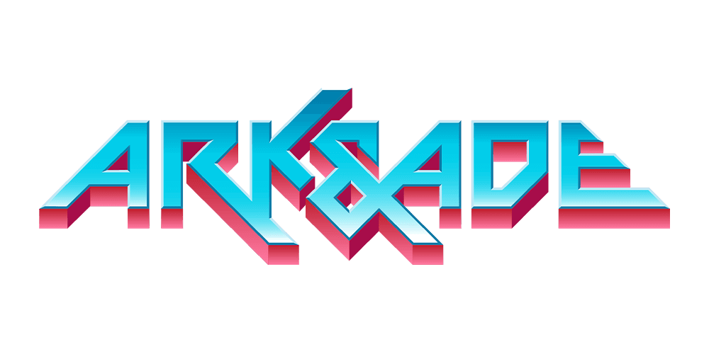
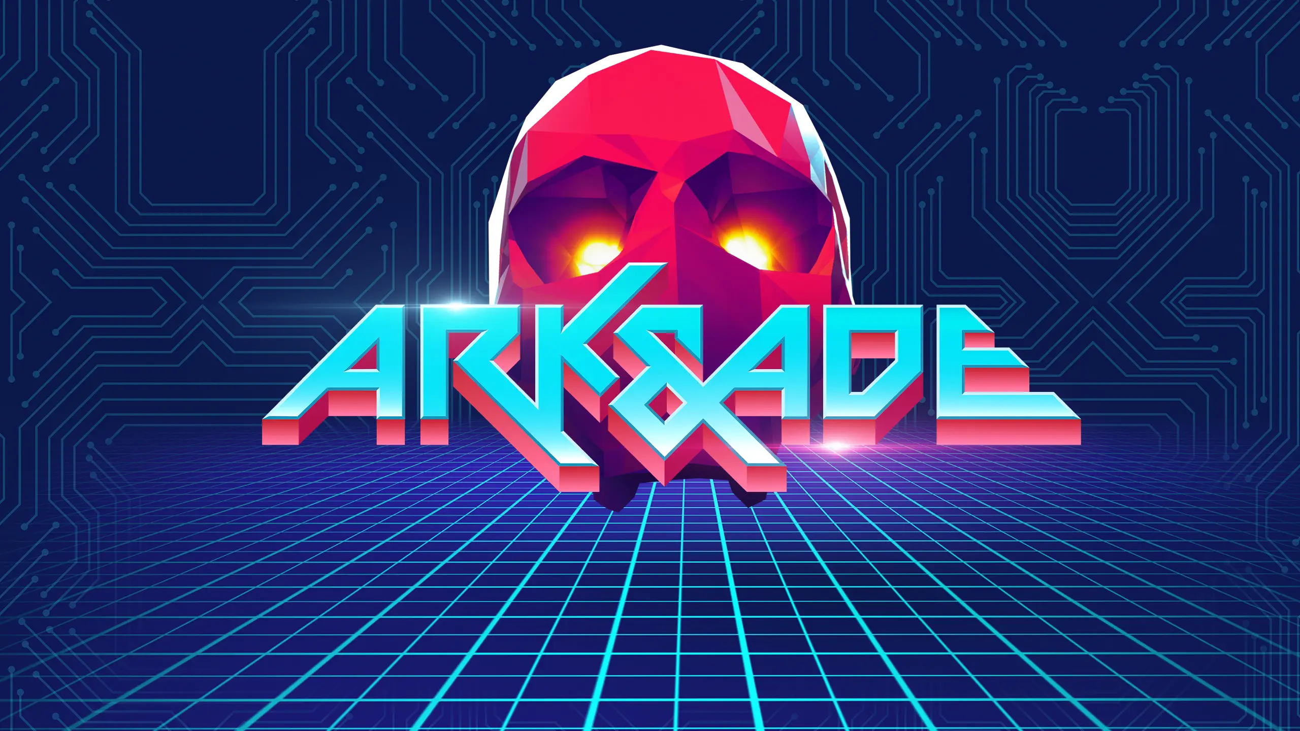
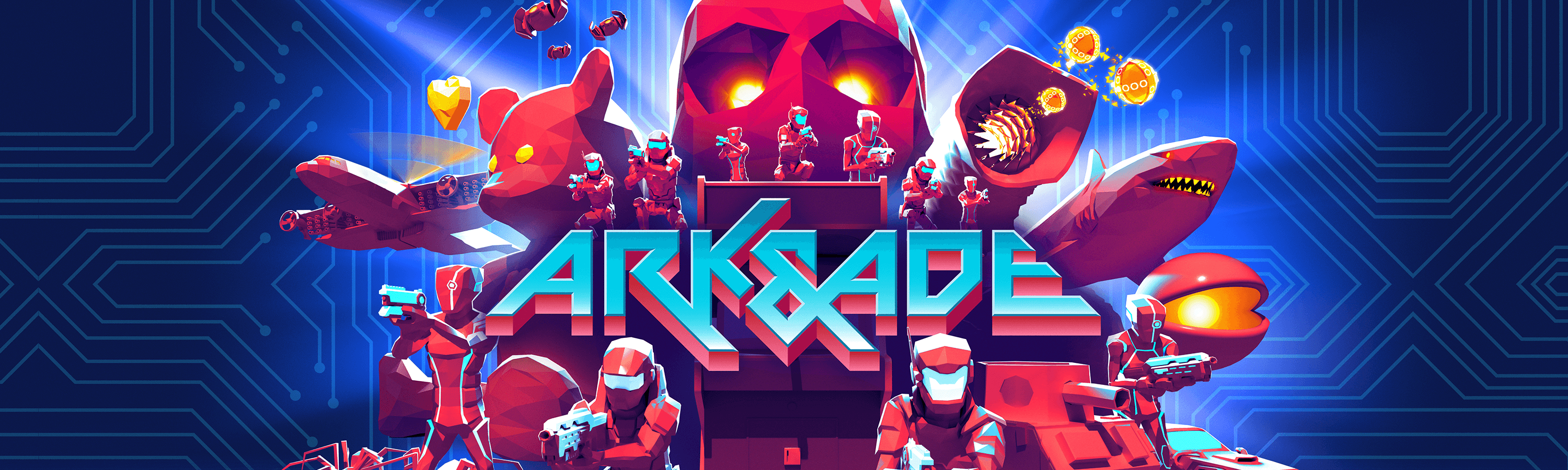
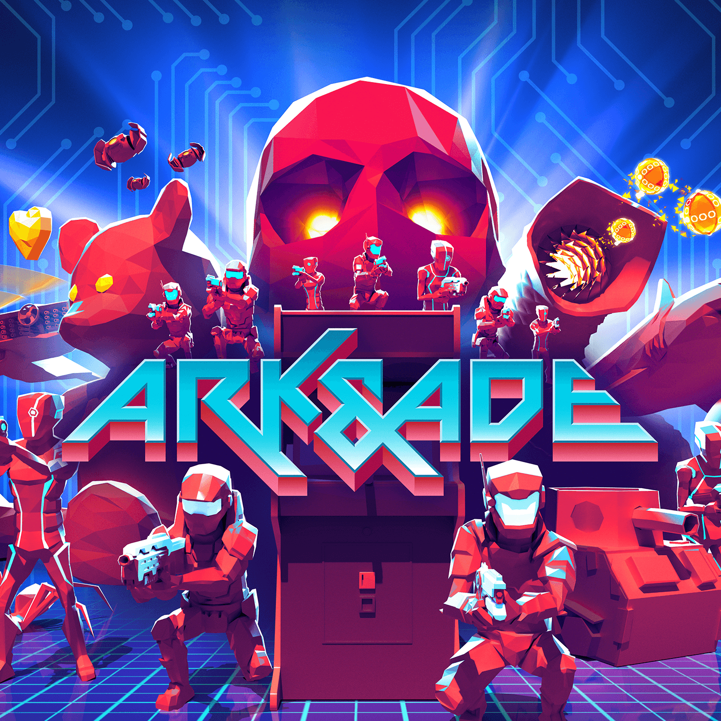
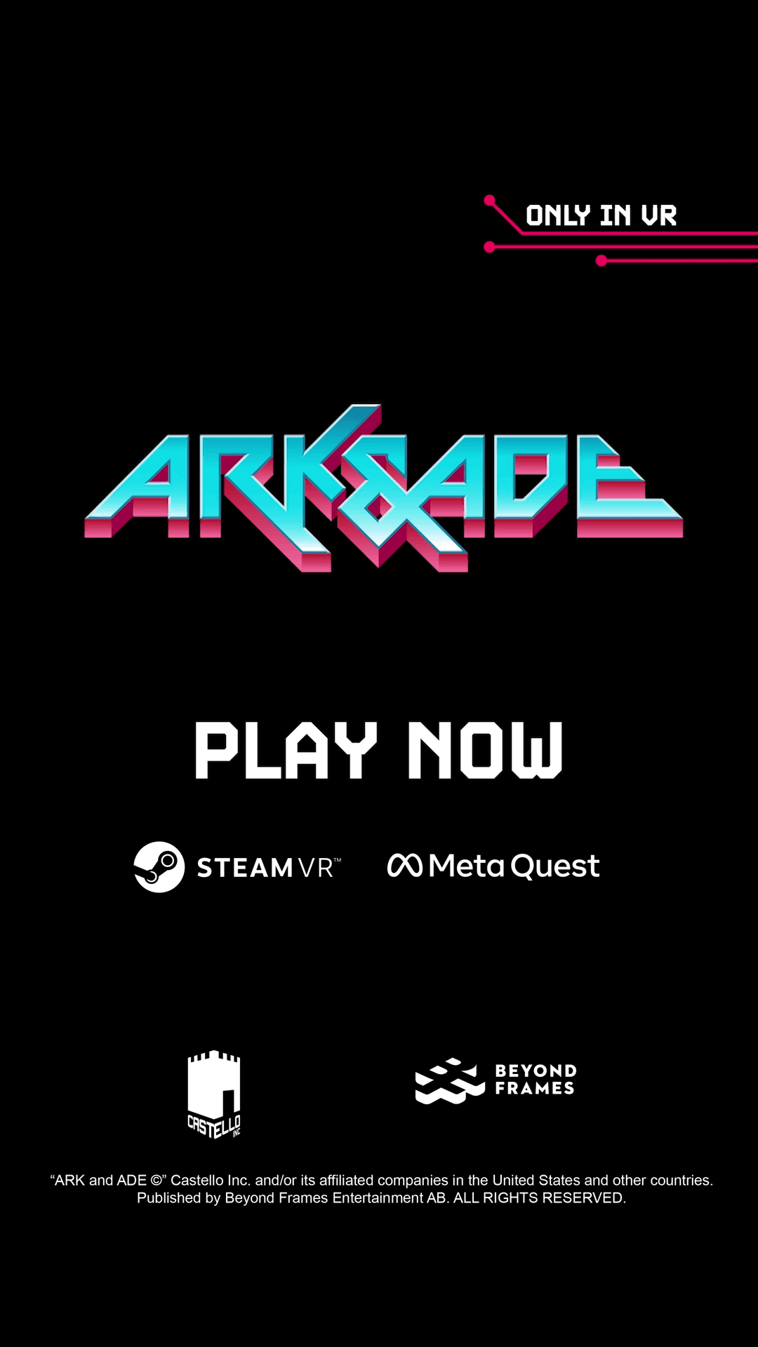
Final Ark & Ade logo
Reworked after the title change to integrate the ampersand without losing speed, balance or attitude.
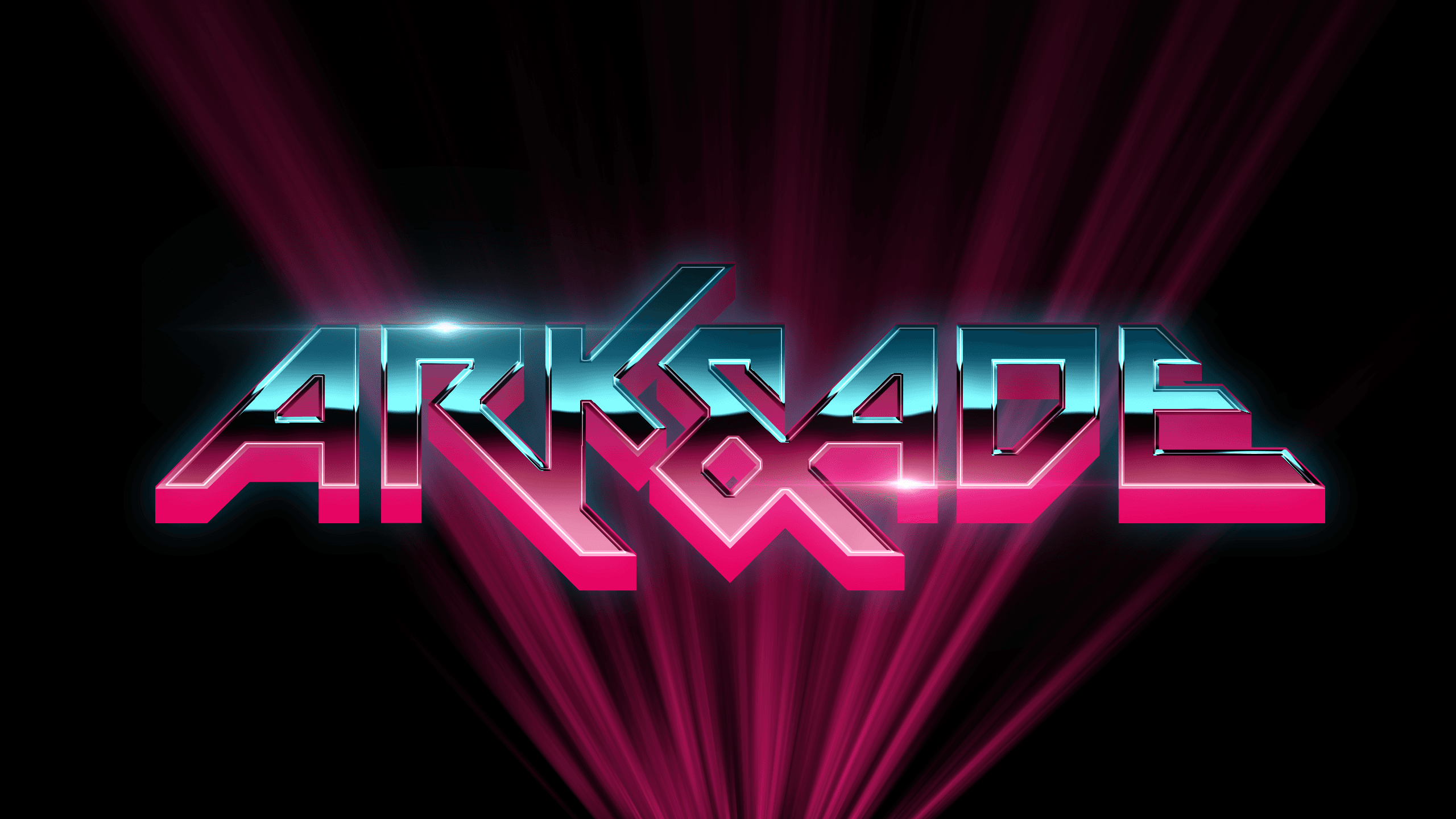
Chrome logo treatment
A high-impact version of the final logo, built for trailers, hero assets and campaign moments where the brand needed to feel louder and more cinematic.
Final Ark & Ade logo
Reworked after the title change to integrate the ampersand without losing speed, balance or attitude.
Chrome logo treatment
A high-impact version of the final logo, built for trailers, hero assets and campaign moments where the brand needed to feel louder and more cinematic.
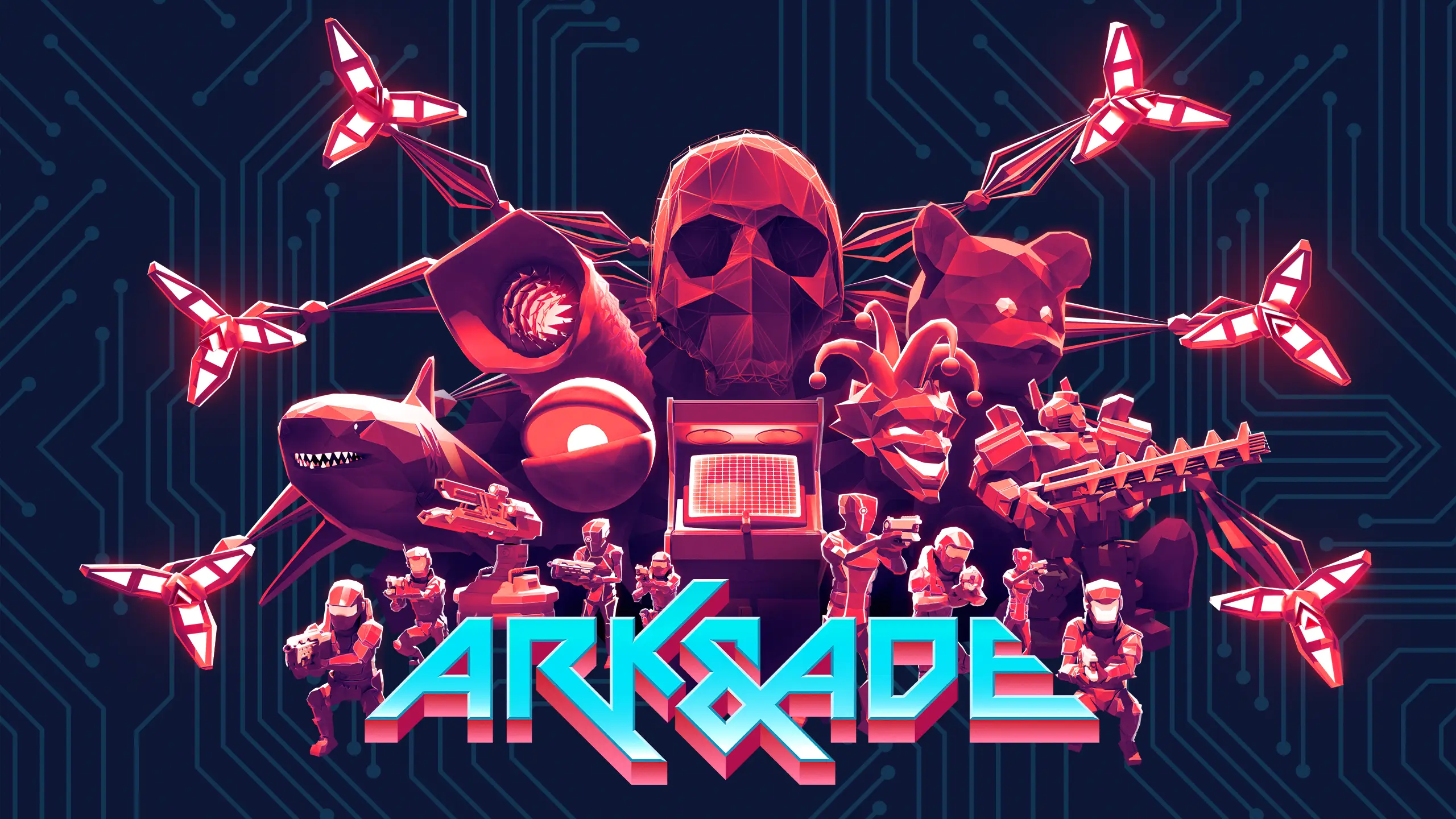
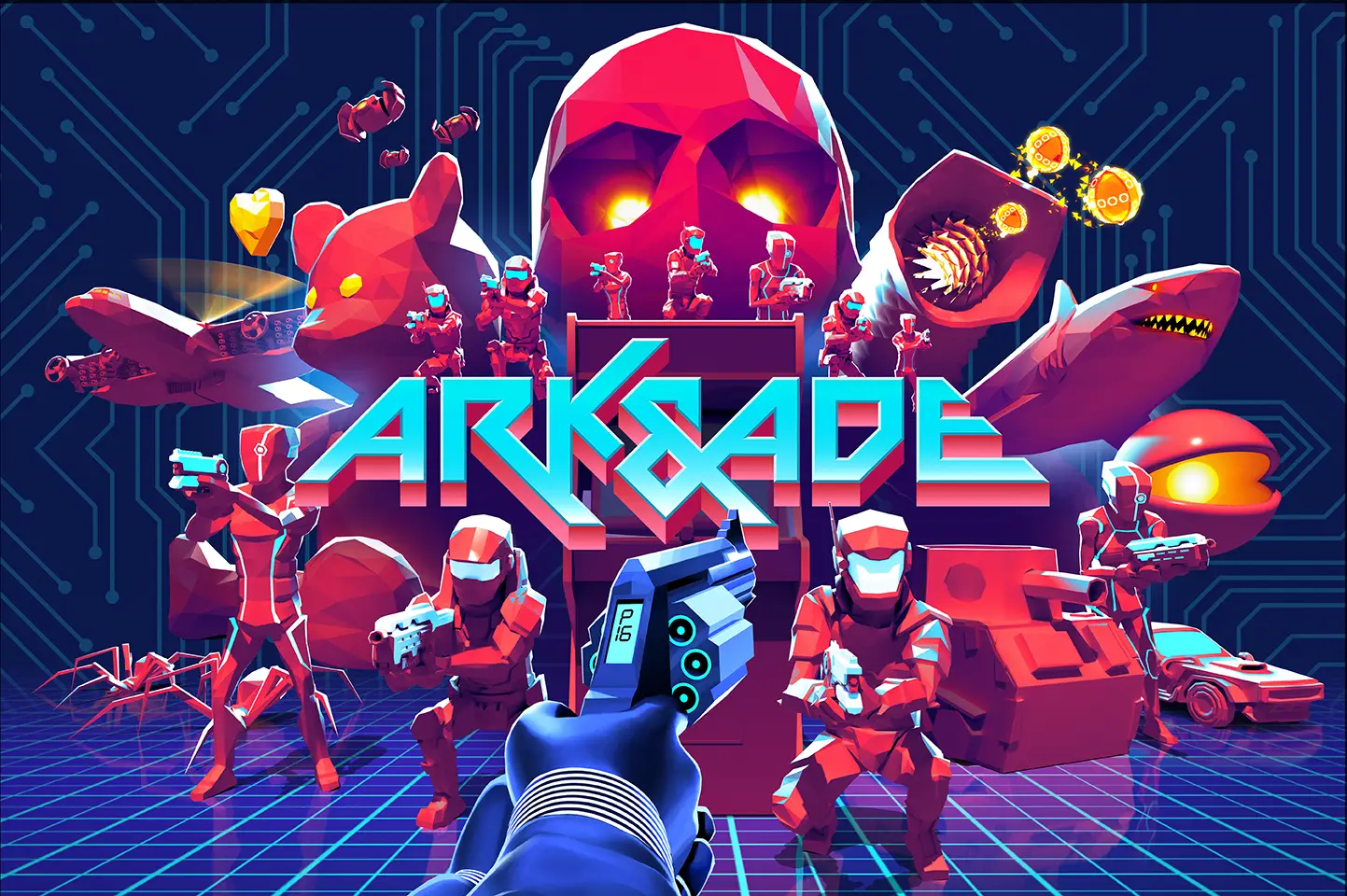
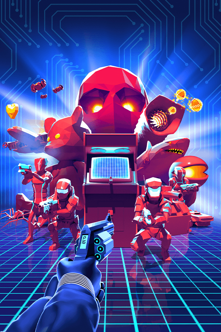
Key art as a flexible marketing asset
Key art as a flexible marketing asset
The key art needed to do more than capture the mood of the game,
it had to work as a flexible marketing asset across store pages, trailers, social formats and campaign material.
I briefed the artwork around a clear arcade-futurist composition: the protagonist, enemy soldiers, ADE as a large red skull, boss references and the digital grid environment of the game.
Important elements needed to be separated and movable so the artwork could be adapted into different formats without rebuilding the visual identity from scratch.
This made the key art function as a campaign toolkit rather than a single static image. It could support launch assets, trailer endcards, store capsules, social crops and other marketing surfaces while keeping the same visual world intact.
The key art needed to do more than capture the mood of the game, it had to work as a flexible marketing asset across store pages, trailers, social formats and campaign material.
I briefed the artwork around a clear arcade-futurist composition: the protagonist, enemy soldiers, ADE as a large red skull, boss references and the digital grid environment of the game.
Important elements needed to be separated and movable so the artwork could be adapted into different formats without rebuilding the visual identity from scratch.
This made the key art function as a campaign toolkit rather than a single static image. It could support launch assets, trailer endcards, store capsules, social crops and other marketing surfaces while keeping the same visual world intact.

Campaign expression
The campaign expression for Ark & Ade was built around the same attitude as the visual identity:
loud, self-aware, action-heavy and unapologetic.
The goal was to make the game feel like a neon arcade-action fantasy rather than a quiet indie VR title. This tone carried into trailer concepts, store-facing assets, social communication and the way the game’s boss encounters and 80s references were presented.
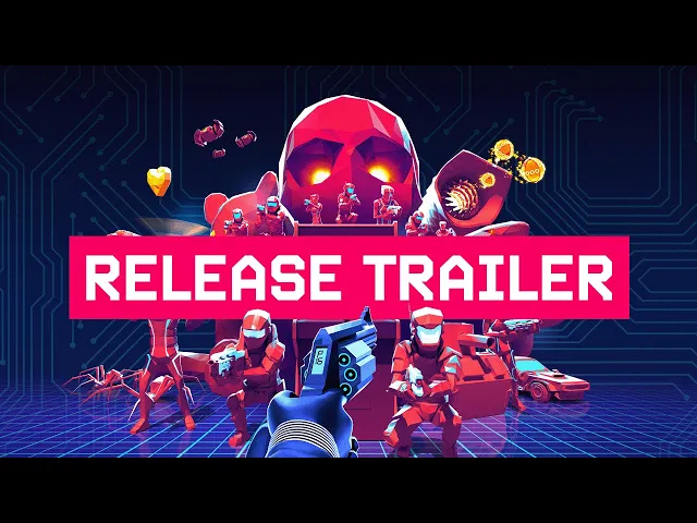
For the release trailer, I contributed to the creative premise and tonal direction together with another creative. The idea was to frame the trailer through an exaggerated 80s action hero voice, turning standard feature communication into entertainment while still supporting the core pillars of the game: VR shooting, enemy waves, oversized weapons, arcade environments and boss encounters.
The campaign expression for Ark & Ade was built around the same attitude as the visual identity:
loud, self-aware, action-heavy and unapologetic.
The goal was to make the game feel like a neon arcade-action fantasy rather than a quiet indie VR title. This tone carried into trailer concepts, store-facing assets, social communication and the way the game’s boss encounters and 80s references were presented.
For the release trailer,
I contributed to the creative premise and tonal direction together with another creative.
The idea was to frame the trailer through an exaggerated 80s action hero voice, turning standard feature communication into entertainment while still supporting the core pillars of the game: VR shooting, enemy waves, oversized weapons, arcade environments and boss encounters.
The campaign expression for Ark & Ade was built around the same attitude as the visual identity: loud, self-aware, action-heavy and unapologetic.
The goal was to make the game feel like a neon arcade-action fantasy rather than a quiet indie VR title. This tone carried into trailer concepts, store-facing assets, social communication and the way the game’s boss encounters and 80s references were presented.
For the release trailer, I contributed to the creative premise and tonal direction together with another creative. The idea was to frame the trailer through an exaggerated 80s action hero voice, turning standard feature communication into entertainment while still supporting the core pillars of the game: VR shooting, enemy waves, oversized weapons, arcade environments and boss encounters.
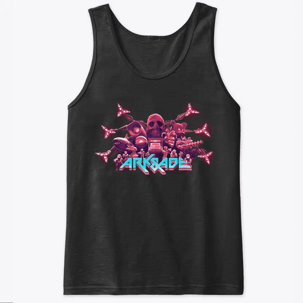
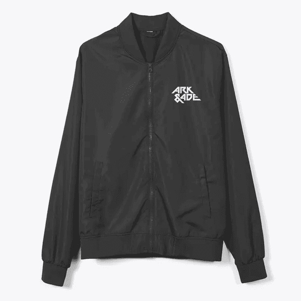
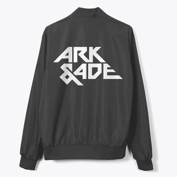

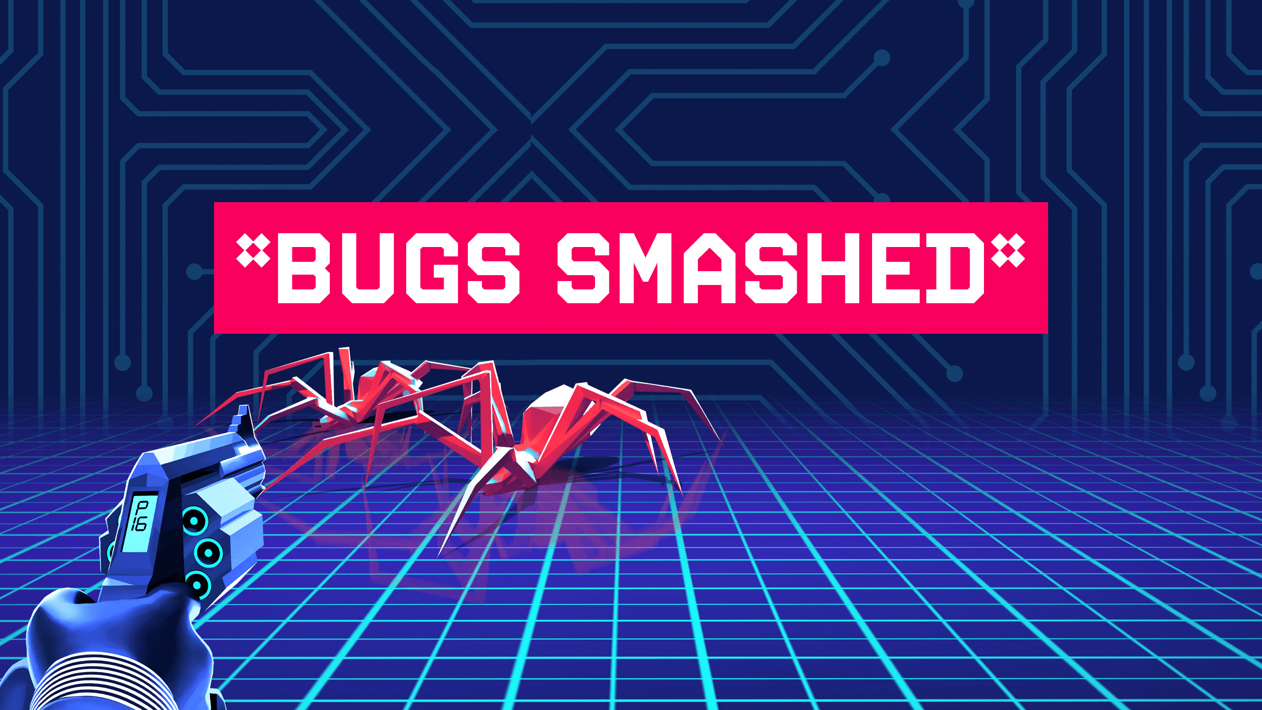
Across the campaign
The campaign identity carried into trailer graphics, merch, store assets and social communication, keeping the same loud arcade-action tone across multiple touchpoints.
Takeaway
A louder brand voice
Ark & Ade moved from familiar retro inspiration
toward a more confident, unapologetic campaign identity.
A more ownable visual system
Logo, key art, trailer graphics, merch and store assets
were aligned around the same neon arcade-action world.
Built for marketing use
The identity was designed to work across formats,
platforms and campaign touchpoints, not just as isolated artwork.
For me, the project became a clear example of how
brand direction, logo design, key art and campaign thinking
can work together to make a smaller game feel sharper,
more confident and easier to market.
A louder brand voice
Ark & Ade moved from familiar retro inspiration toward a more confident, unapologetic campaign identity.
A more ownable visual system
Logo, key art, trailer graphics, merch and store assets were aligned around the same neon arcade-action world.
Built for marketing use
The identity was designed to work across formats, platforms and campaign touchpoints, not just as isolated artwork.
For me, the project became a clear example of how brand direction, logo design, key art and campaign thinking can work together to make a smaller game feel sharper, more confident and easier to market.