Catstack
Catstack
Overview
Ark & Ade is a fast VR arcade shooter built around neon environments, oversized weapons, enemy waves and over-the-top 80s action references. My role was to help turn that energy into a sharper campaign identity across logo, key art, trailers, store assets and social communication
Role
Art Direction, logo direction, key art briefing,
campaign concept, marketing assets
Focus
Brand identity, logo direction, key art direction, campaign tone, store and trailer assets
Output
Logo system, key art brief, campaign concept, trailer direction support, store assets, social media visual direction
The challenge: making a small game feel loud
The challenge:
Making a small
game feel loud
The challenge:
Making a small game feel loud
Ark & Ade already had a strong core: fast VR shooting, neon arcade environments, oversized weapons and over-the-top 80s action references. The challenge was to turn that energy into a louder and more ownable campaign identity.
Rather than positioning the game as just another retro-inspired VR title, the goal was to help Castello Inc. speak with more confidence: honest, funny, direct and unapologetic. Proud of what the game was, sharp enough to stand out, and loud enough to carry across logo, key art, trailers, store assets and social communication.
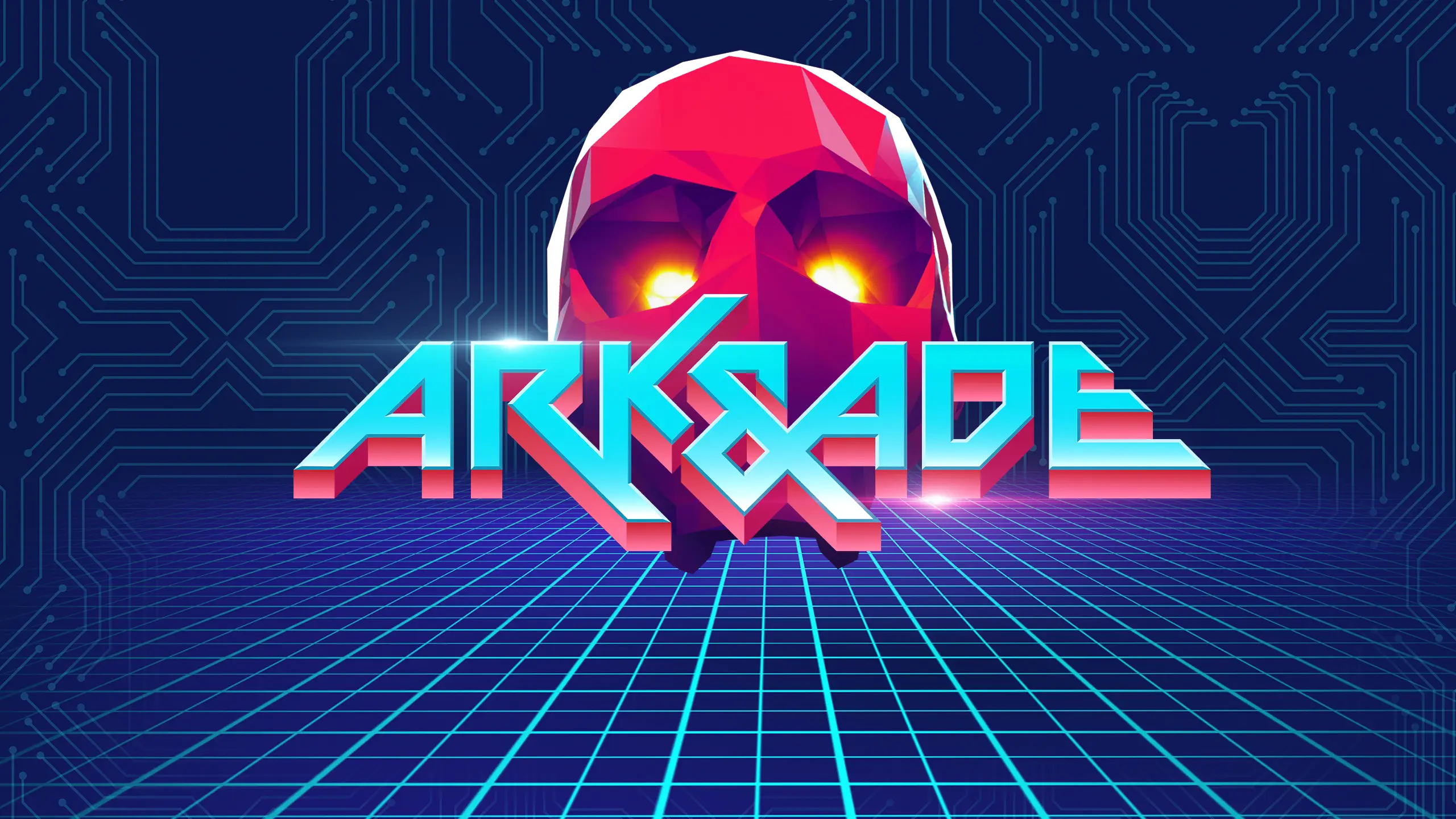
The game was originally called ArkAde, and much of the early logo and identity work was built around that name. When the title later had to change to Ark & Ade, the logo needed to be reworked around an ampersand without losing the arcade-futurist attitude, speed and readability of the original direction.
Ark & Ade already had a strong core: fast VR shooting, neon arcade environments, oversized weapons and over-the-top 80s action references.
The challenge was to turn that energy into a louder and more ownable campaign identity.
Rather than positioning the game as just another retro-inspired VR title, the goal was to help Castello Inc. speak with more confidence: honest, funny, direct and unapologetic. Proud of what the game was, sharp enough to stand out, and loud enough to carry across logo, key art, trailers, store assets and social communication.
The game was originally called ArkAde, and much of the early logo and identity work was built around that name. When the title later had to change to Ark & Ade, the logo needed to be reworked around an ampersand without losing the arcade-futurist attitude, speed and readability of the original direction.
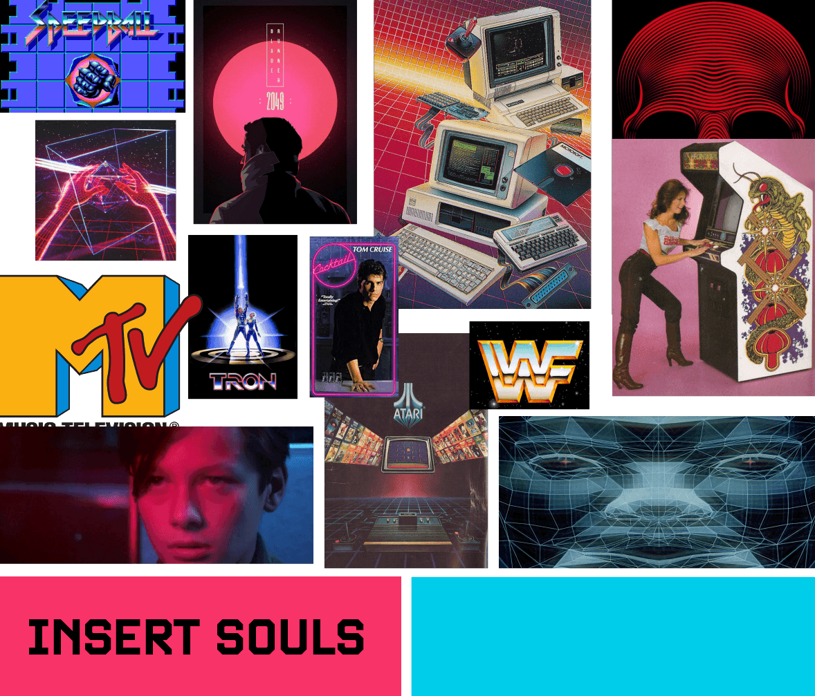
Moodboard
Key art as a flexible marketing asset
Key art as a flexible marketing asset
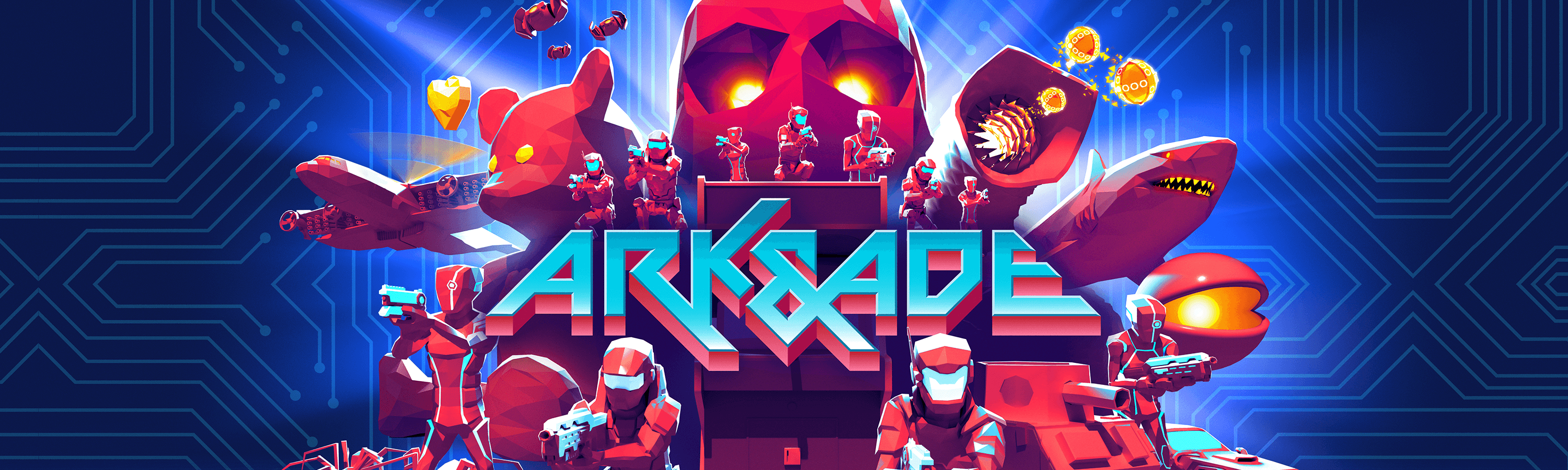
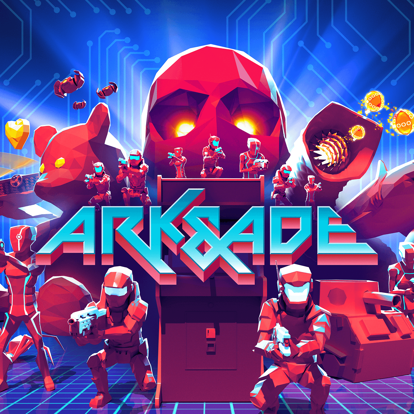
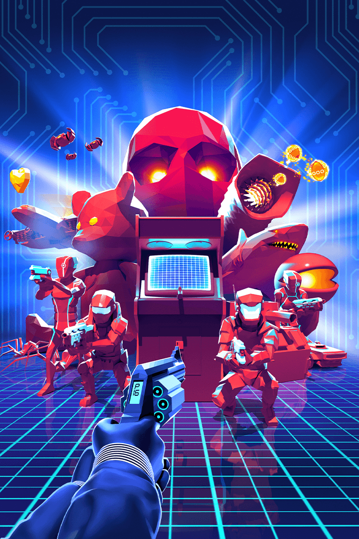
The key art needed to do more than capture the mood of the game,
it had to work as a flexible marketing asset across store pages, trailers, social formats and campaign material.
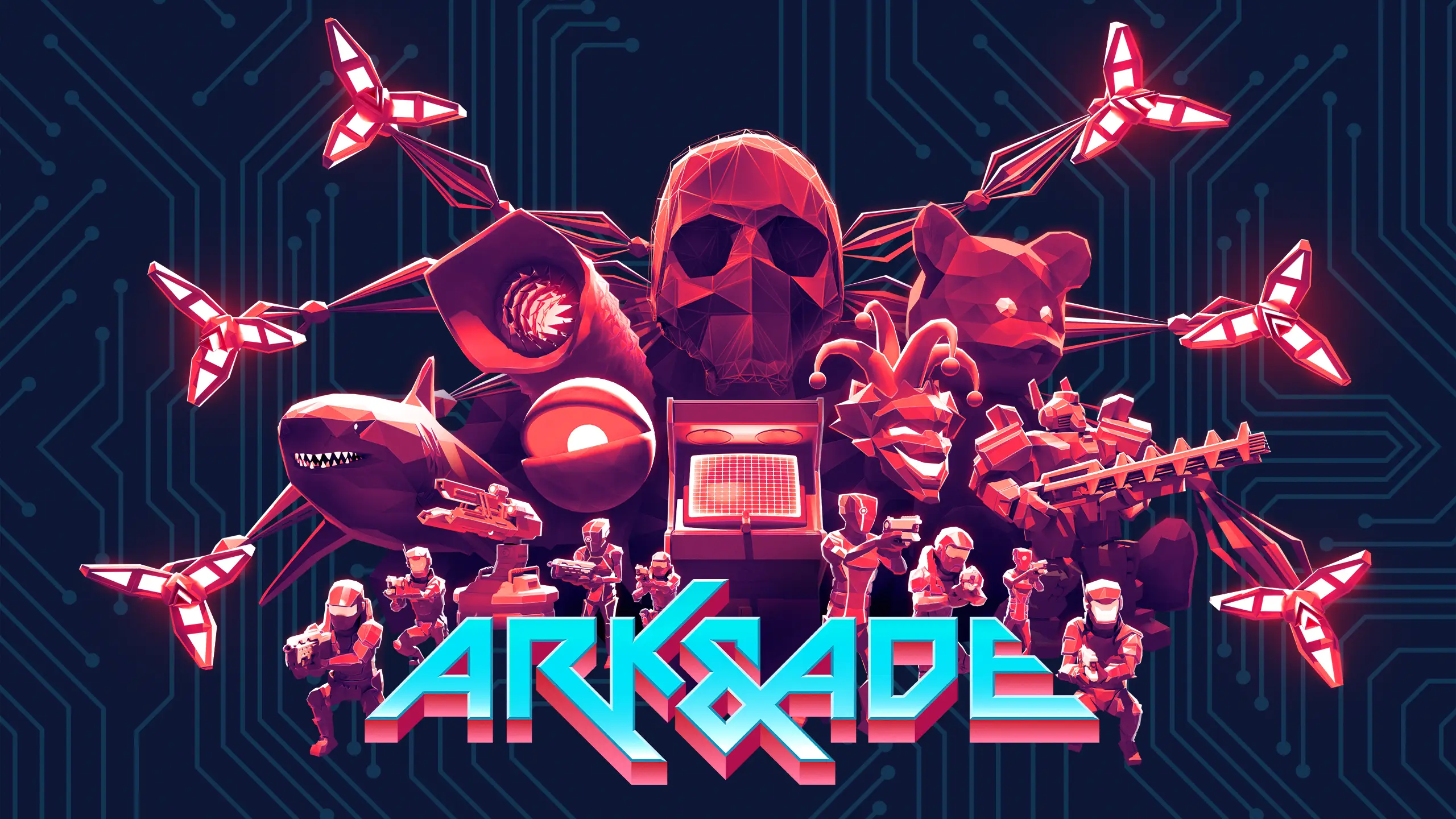
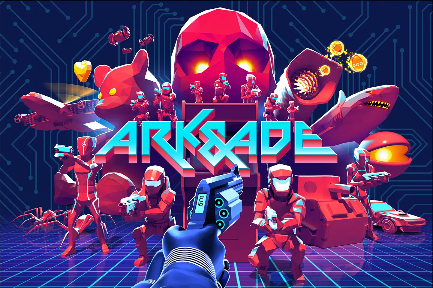
I briefed the artwork around a clear arcade-futurist composition: the protagonist, enemy soldiers, ADE as a large red skull, boss references and the digital grid environment of the game.
Important elements needed to be separated and movable so the artwork could be adapted into different formats without rebuilding the visual identity from scratch.
This made the key art function as a campaign toolkit rather than a single static image. It could support launch assets, trailer endcards, store capsules, social crops and other marketing surfaces while keeping the same visual world intact.
The key art needed to do more than capture the mood of the game, it had to work as a flexible marketing asset across store pages, trailers, social formats and campaign material.
I briefed the artwork around a clear arcade-futurist composition: the protagonist, enemy soldiers, ADE as a large red skull, boss references and the digital grid environment of the game.
Important elements needed to be separated and movable so the artwork could be adapted into different formats without rebuilding the visual identity from scratch.
This made the key art function as a campaign toolkit rather than a single static image. It could support launch assets, trailer endcards, store capsules, social crops and other marketing surfaces while keeping the same visual world intact.

Takeaway
A louder brand voice
Ark & Ade moved from familiar retro inspiration
toward a more confident, unapologetic campaign identity.
A more ownable visual system
Logo, key art, trailer graphics, merch and store assets
were aligned around the same neon arcade-action world.
Built for marketing use
The identity was designed to work across formats,
platforms and campaign touchpoints, not just as isolated artwork.
For me, the project became a clear example of how
brand direction, logo design, key art and campaign thinking
can work together to make a smaller game feel sharper,
more confident and easier to market.
A louder brand voice
Ark & Ade moved from familiar retro inspiration toward a more confident, unapologetic campaign identity.
A more ownable visual system
Logo, key art, trailer graphics, merch and store assets were aligned around the same neon arcade-action world.
Built for marketing use
The identity was designed to work across formats, platforms and campaign touchpoints, not just as isolated artwork.
For me, the project became a clear example of how brand direction, logo design, key art and campaign thinking can work together to make a smaller game feel sharper, more confident and easier to market.