Making a darker TMNT VR game visible

Making a darker TMNT VR game visible

Overview

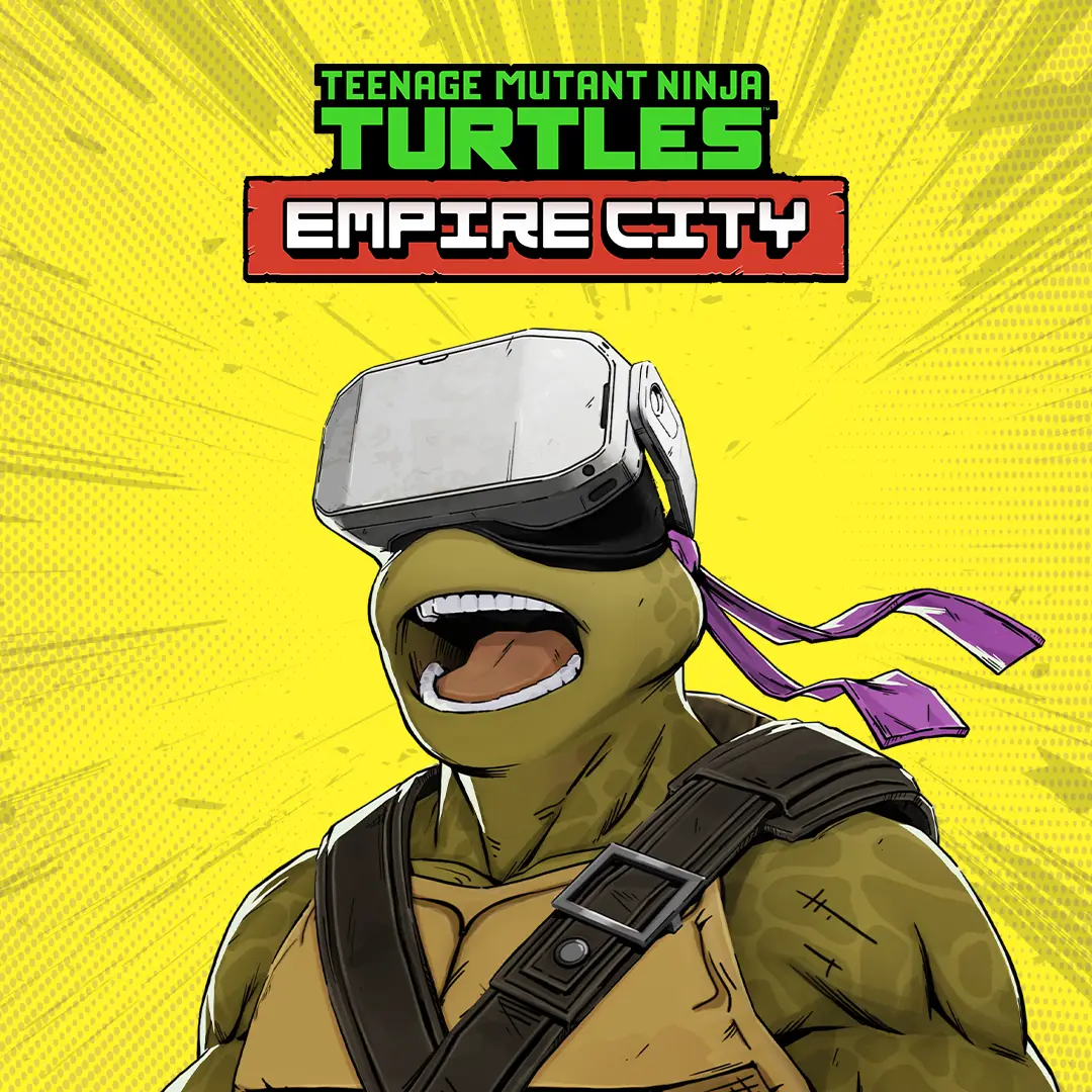
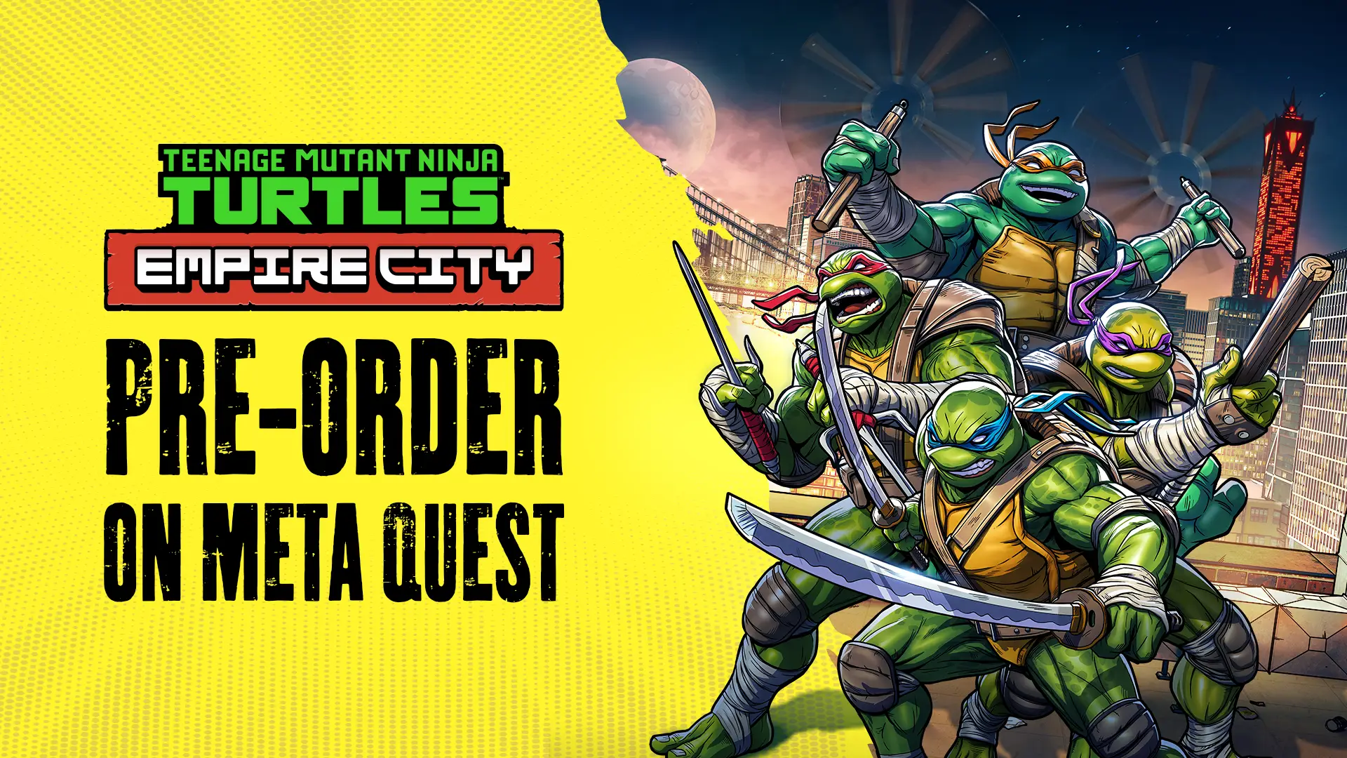
TMNT: Empire City is a darker VR take on the Teenage Mutant Ninja Turtles universe, set in a gritty New York of rooftops, shadows and Foot Clan presence.

My role was to translate that darker in-game tone into a brighter, clearer marketing identity that could stand out across storefronts, trailers, social media and campaign assets.

I led the visual marketing direction, including the Empire City title treatment, brand system, key art direction, campaign assets, Deluxe Edition content and merch.

Role

Marketing Art Director

Focus

Visual identity, visibility, title treatment, brand system, key art direction, campaign assets

Output

Title treatment, brand toolkit, key art direction, store assets, social assets, trailer graphics, Deluxe Edition content and merch
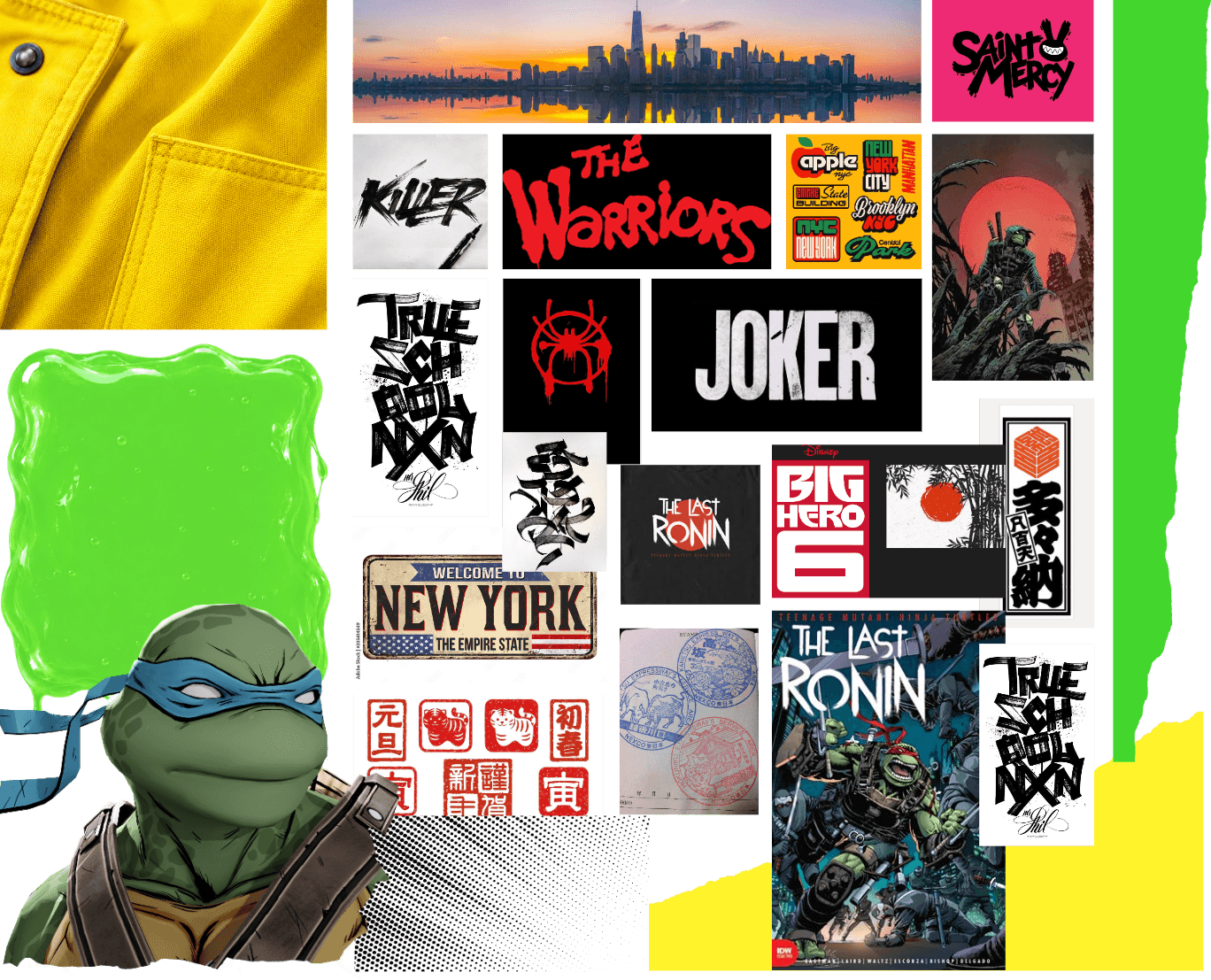
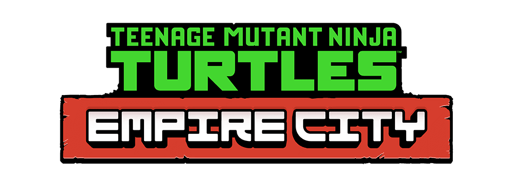
The Challenge

The challenge

The challenge:

TMNT: Empire City leaned into a darker, comic-inspired New York atmosphere of rooftops, shadows, ninjas and Foot Clan presence. Inside VR, that darkness helped the game feel immersive and atmospheric.

The challenge was making the same tone work outside the headset. On storefronts, social media, mobile screens and trailer thumbnails, the campaign needed to become brighter, clearer and easier to recognize at a glance — without losing the darker TMNT identity.

TMNT: Empire City leaned into a darker, comic-inspired New York atmosphere of rooftops, shadows, ninjas and Foot Clan presence.

The challenge was making that tone work outside the headset. On storefronts, social media, mobile screens and trailer thumbnails, the identity needed to preserve the darker mood while becoming brighter, clearer and easier to recognize at a glance.

TMNT: Empire City leaned into a darker, comic-inspired New York atmosphere of rooftops, shadows, ninjas and Foot Clan presence. Inside VR, that darkness helped the game feel immersive and atmospheric.

The challenge was making the same tone work outside the headset. On storefronts, social media, mobile screens and trailer thumbnails, the campaign needed to become brighter, clearer and easier to recognize at a glance — without losing the darker TMNT identity.

Building a brighter brand system

Building a brighter brand system

I created the Empire City title treatment and built the marketing brand system around bold color, rugged typography, comic-book texture and tactile graphic elements. The goal was to translate the darker New York tone of the game into a brighter, clearer campaign identity that could stand out across store assets, social posts, trailers, merch and campaign material.

I created the Empire City logo and built the marketing brand system around bold color, rugged typography, comic-book texture and tactile graphic elements.


The goal was to connect the darker New York tone of the game with TMNT’s comic-book legacy, while making the campaign brighter, clearer and easier to use across store assets, social posts, trailers, merch and campaign material.

I created the Empire City title treatment and built the marketing brand system around bold color, rugged typography, comic-book texture and tactile graphic elements.

The goal was to translate the darker New York tone of the game into a brighter, clearer campaign identity that could stand out across store assets, social posts, trailers, merch and campaign material.

Moodboard

Logo exploration

Logo exploration

A quick montage of logo directions explored before landing on the final Empire City subtitle treatment.

Early logo direction
An early direction that established the rugged Empire City tone before the title treatment had to be reworked for the official TMNT logo lockup.

Adapting the title treatment

The first logo direction helped define the rugged Empire City tone, but the branding structure changed when the official Teenage Mutant Ninja Turtles logo needed to lead the lockup. The challenge became creating a subtitle treatment that respected the franchise hierarchy while still giving Empire City its own recognizable identity.

Final title treatment
The final title treatment balances franchise hierarchy with a distinct Empire City identity, built to work across key art, store assets and campaign material.

Early logo direction
An early direction that established the rugged Empire City tone before the title treatment had to be reworked for the official TMNT logo lockup.

Adapting the title treatment

Adapting the title treatment

The first logo direction helped define the rugged Empire City tone, but the branding structure changed when the official Teenage Mutant Ninja Turtles logo needed to lead the lockup. The challenge became creating a subtitle treatment that respected the franchise hierarchy while still giving Empire City its own recognizable identity.

Final title treatment
The final title treatment balances franchise hierarchy with a distinct Empire City identity, built to work across key art, store assets and campaign material.

Brand toolkit

Brand toolkit

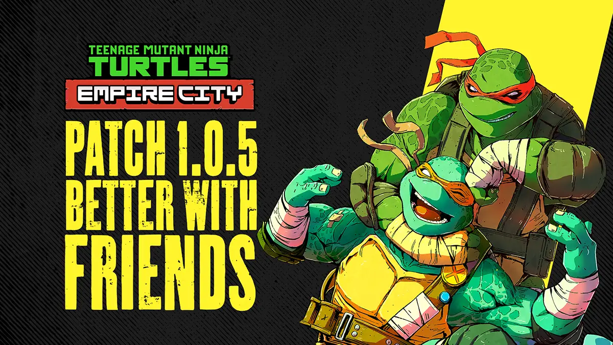
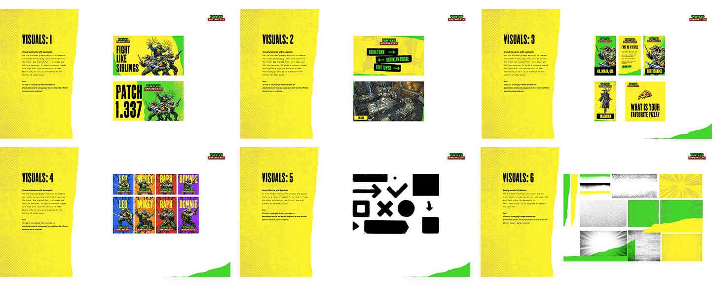
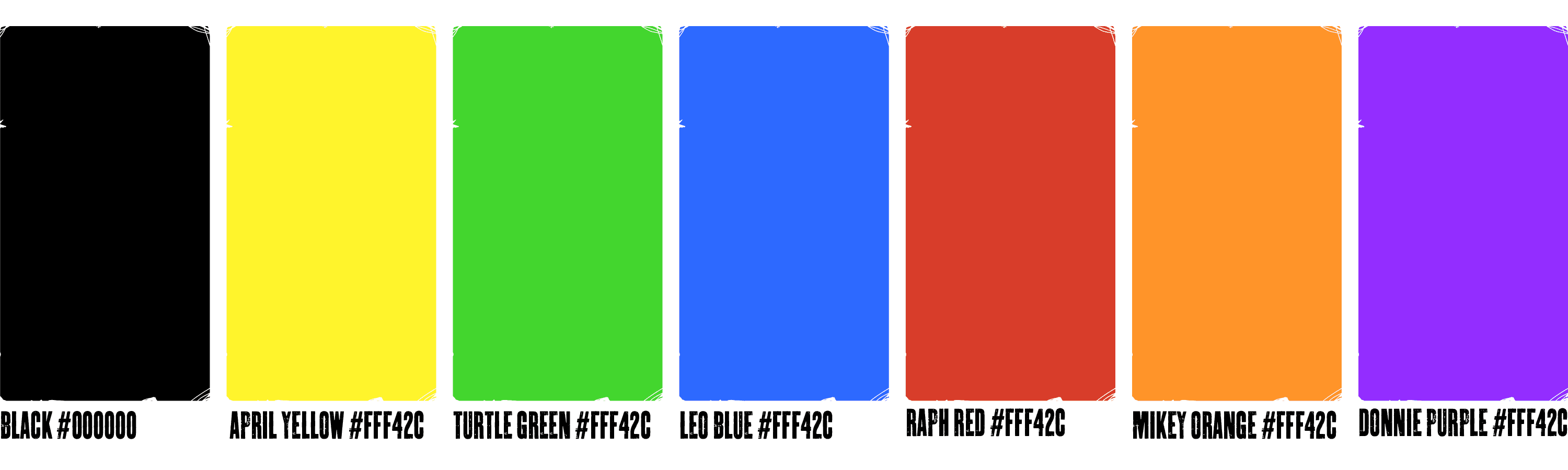
The visual identity was expanded into a practical campaign toolkit: colors, typography, comic textures, halftone patterns, torn-paper elements and reusable assets that could support store pages, social posts, trailers, merch and community communication.
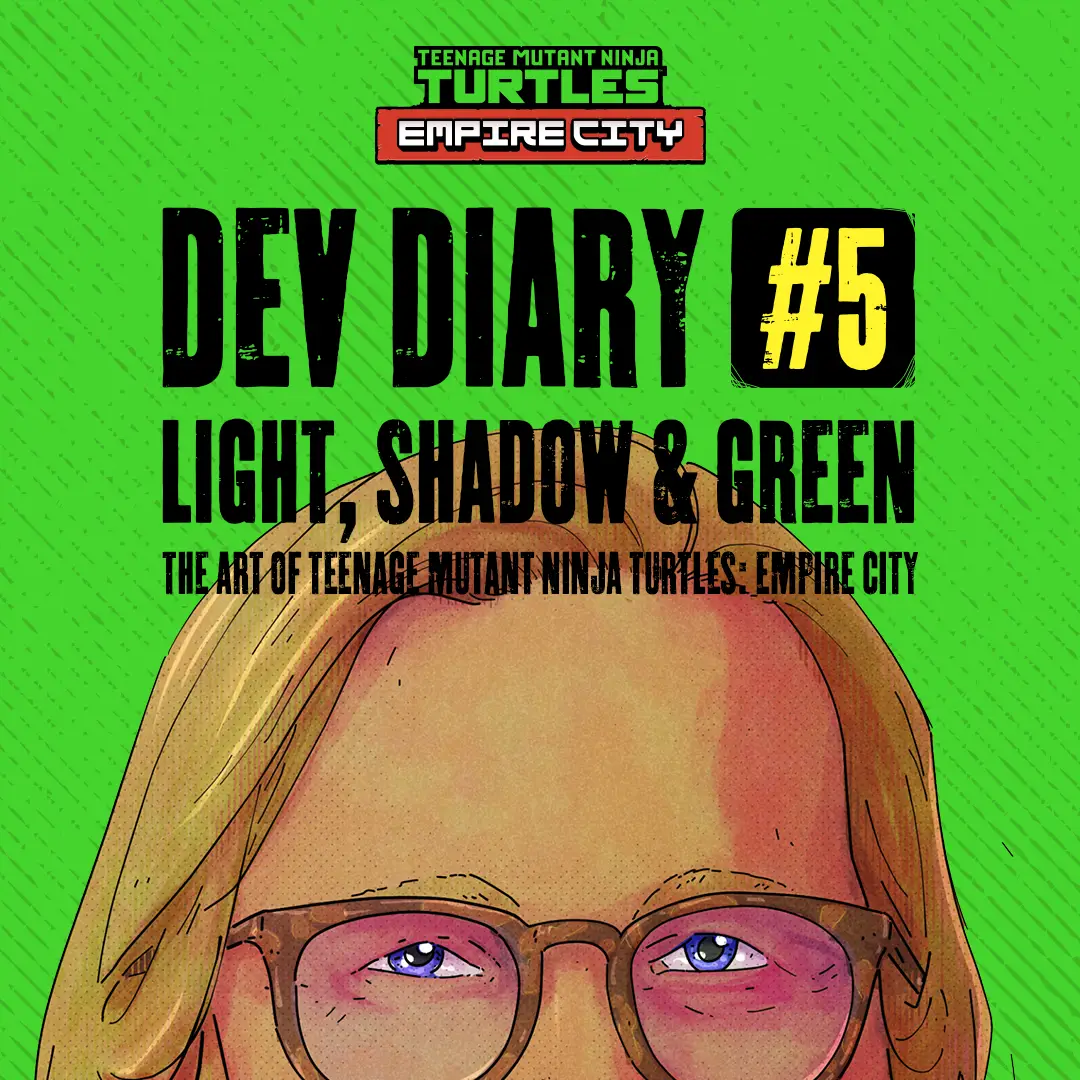
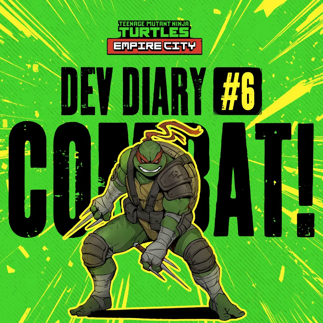
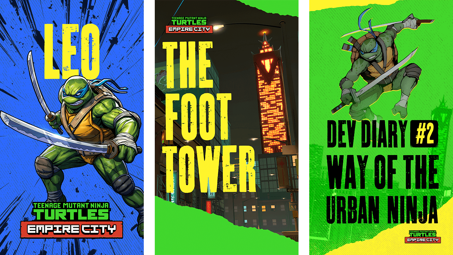
Typography

The typography was chosen to feel rugged, physical and connected to the game’s New York setting. It added a worn, urban quality to the campaign while keeping headlines bold and readable across social, store assets and trailer graphics.

The typography was chosen to feel rugged, physical and connected to the game’s

New York setting.
It added a worn, urban quality to the campaign while keeping headlines bold and readable across social, store assets and trailer graphics.

In use

The type system carried across social posts, dev diary assets, store graphics and campaign updates, keeping the campaign consistent and high-impact.

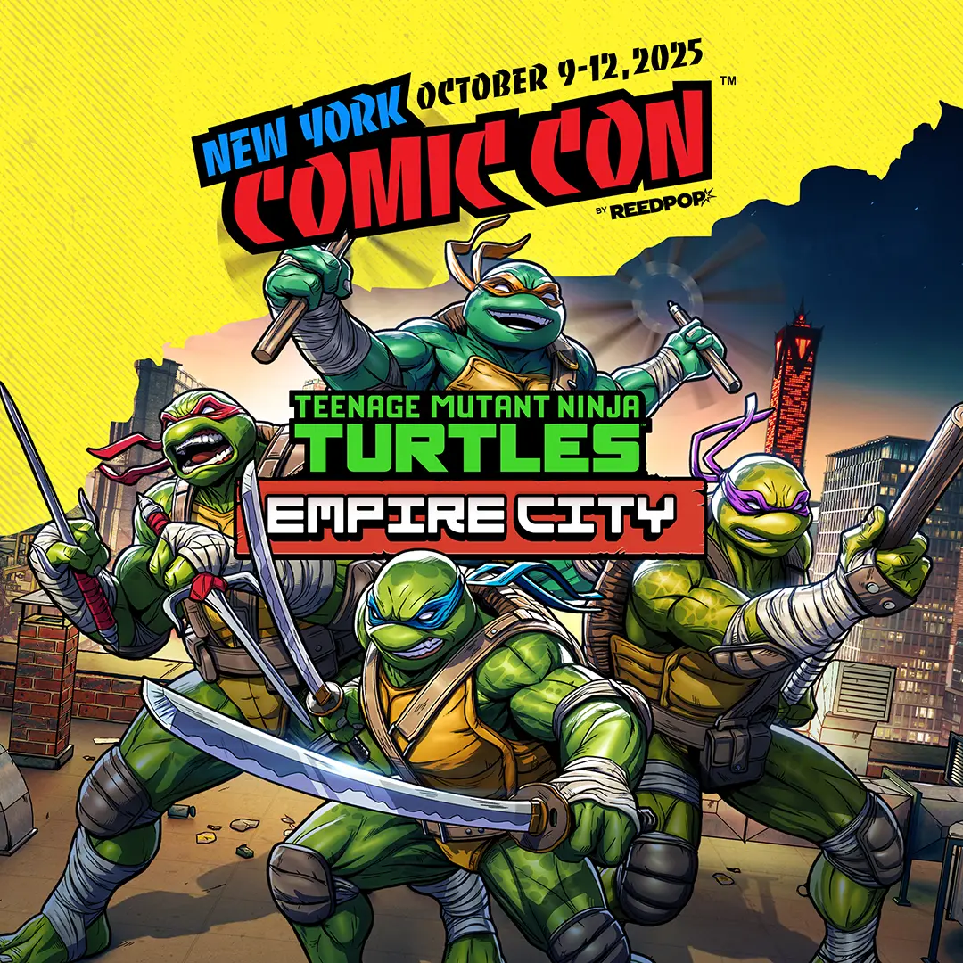
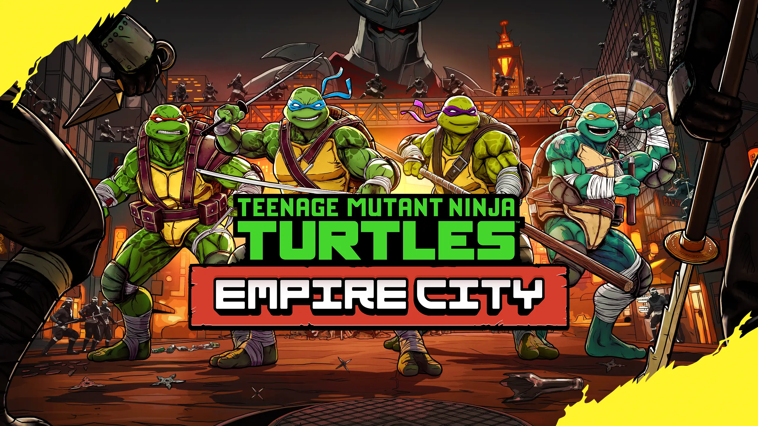
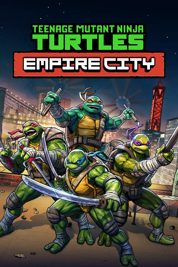
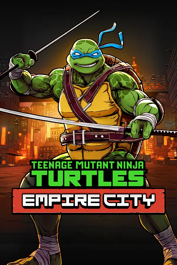
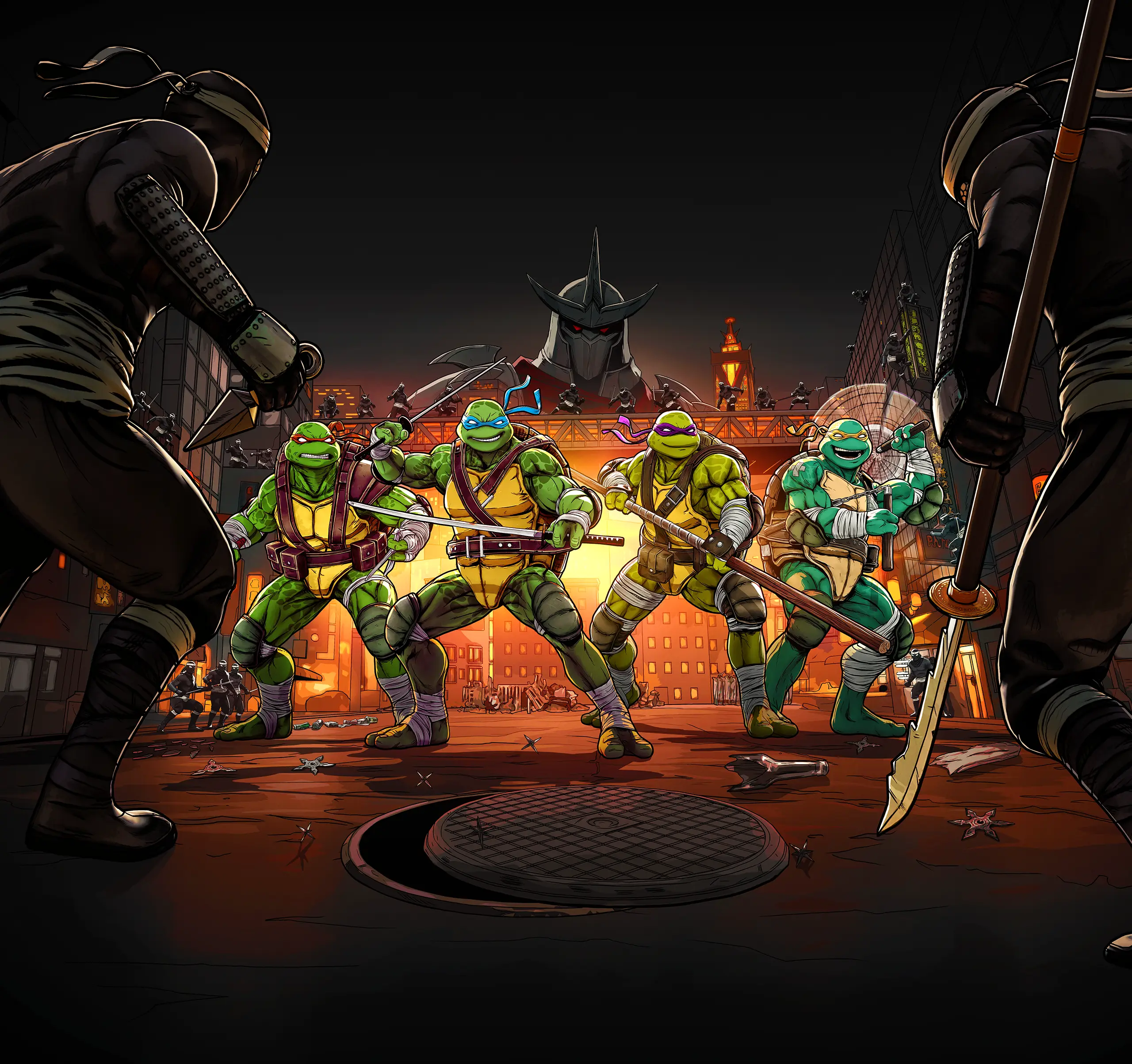
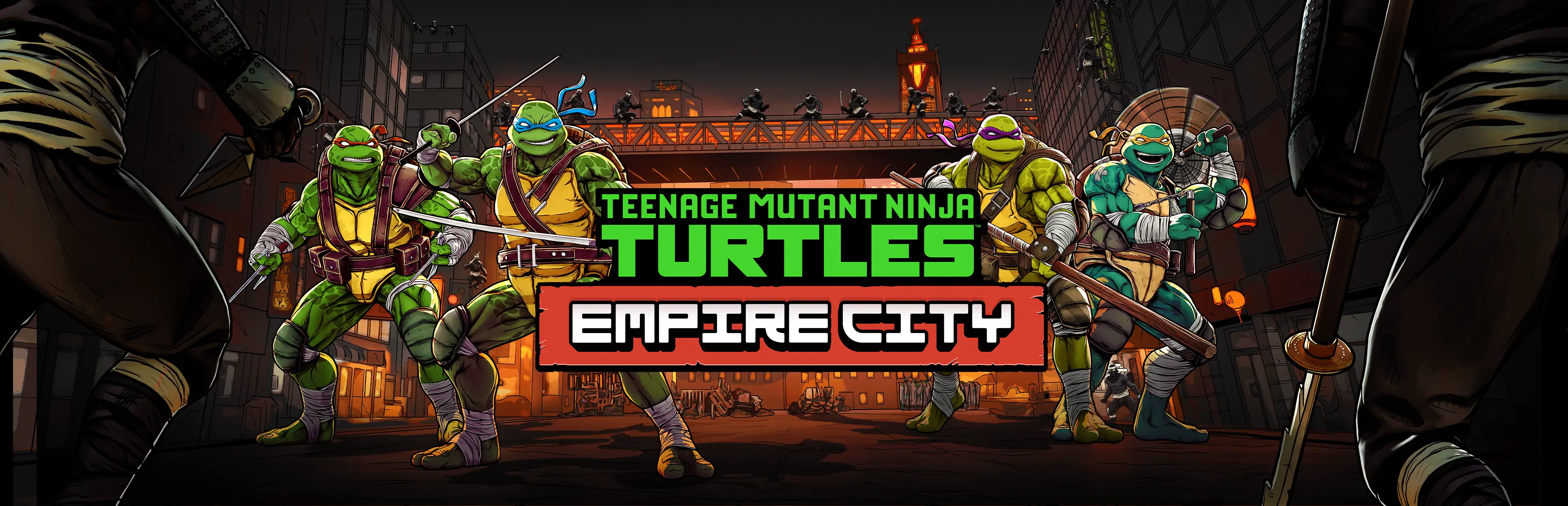
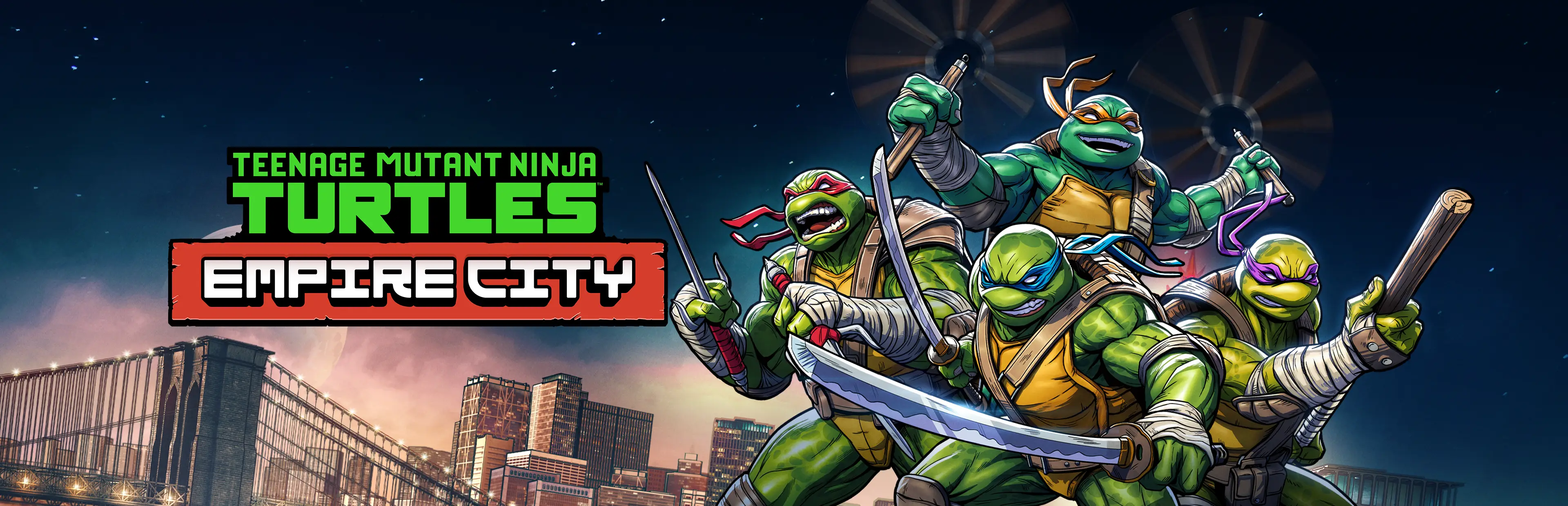
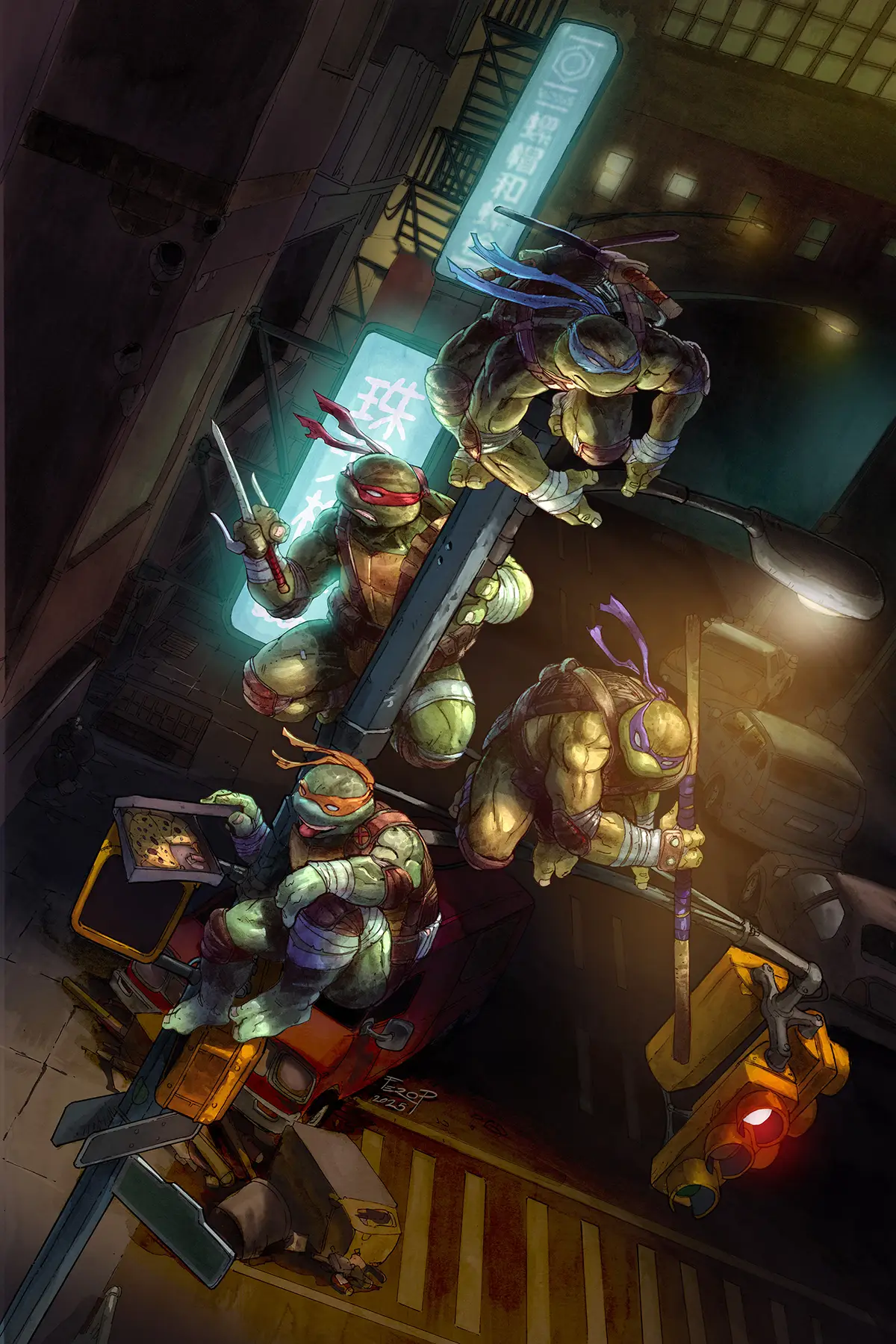
Art directing two key arts for campaign use

I briefed and art directed both key arts used for TMNT: Empire City. The artworks needed to work across storefronts, social crops, trailer endplates, banners and campaign material while staying aligned with the game’s darker tone, the wider TMNT brand and the campaign identity.

Key art 01
Directed for store visibility, character readability and campaign flexibility.

Key art 01
Directed for store visibility, character readability and campaign flexibility.

Key art 01
Directed for store visibility, character readability and campaign flexibility.

Key art 02
Directed to refresh the campaign front and support store, trailer and social formats.

Key art 02
Directed to refresh the campaign front and support store, trailer and social formats.

Key art 02
Directed to refresh the campaign front and support store, trailer and social formats.

Built for multiple formats
Both key arts were directed with crop flexibility, logo placement and campaign reuse in mind.

Built for multiple formats
Both key arts were directed with crop flexibility, logo placement and campaign reuse in mind.

Working with TMNT comic artists

To connect the campaign with TMNT’s comic-book legacy, we commissioned established TMNT comic artists Fero Pe (Brotherhood), Dan Duncan (Karai) and Jason Flowers (Mashima) to create complementary artwork for fan-facing campaign use and Deluxe Edition content. My role was to brief, art direct and coordinate feedback while balancing artist freedom, game accuracy, marketing usability and IP alignment.

To connect the campaign with TMNT’s comic-book legacy, we commissioned established TMNT comic artists Fero Pe (Brotherhood), Dan Duncan (Karai) and Jason Flowers (Mashima) to create complementary artwork for fan-facing campaign use and Deluxe Edition content.

My role was to brief, art direct and coordinate feedback while balancing artist freedom, game accuracy, marketing usability and IP alignment.

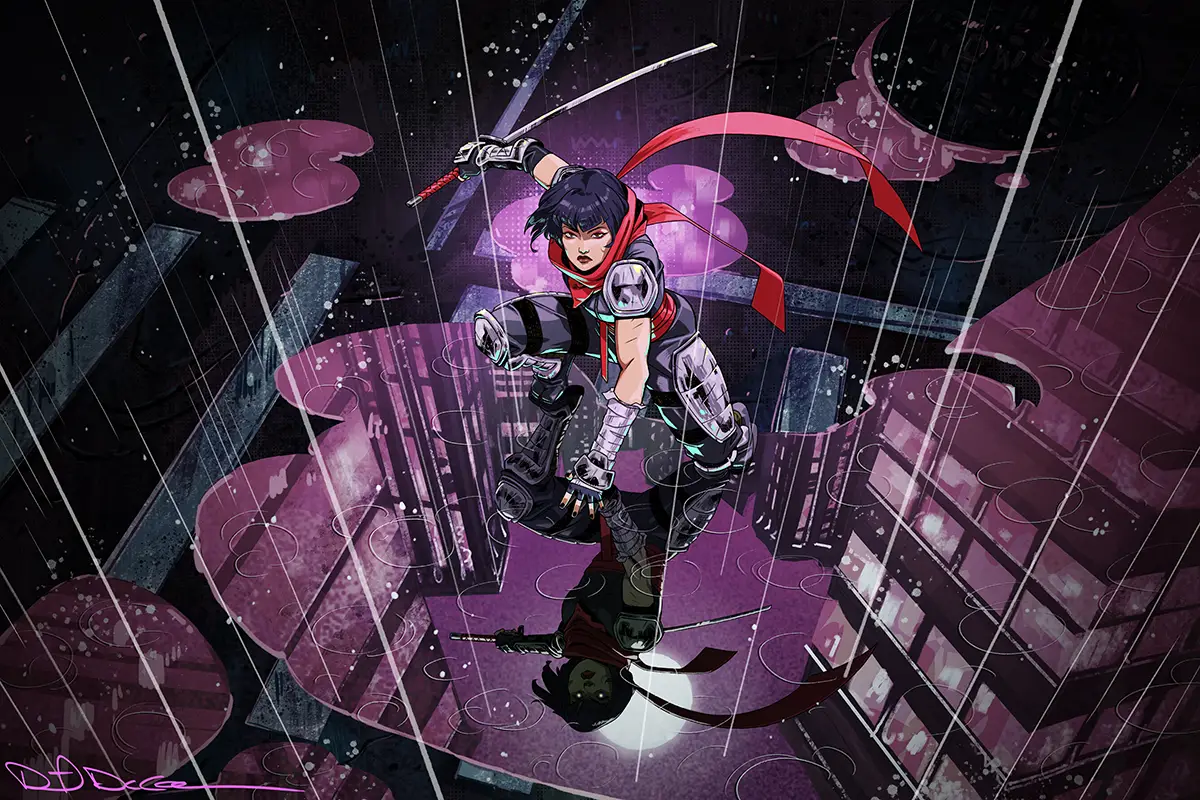
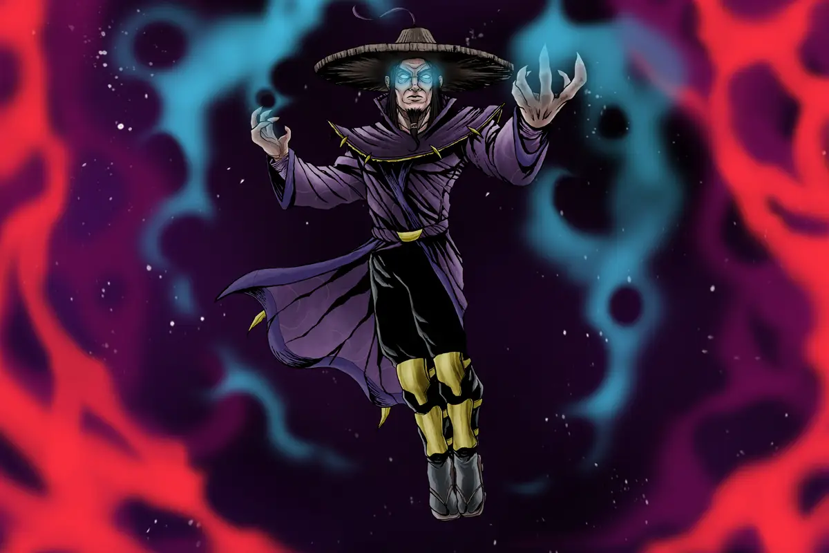
Commissioned comic artworks used across campaign material and as collectible artwork inside the player’s lair in the Deluxe Edition.

Across the campaign

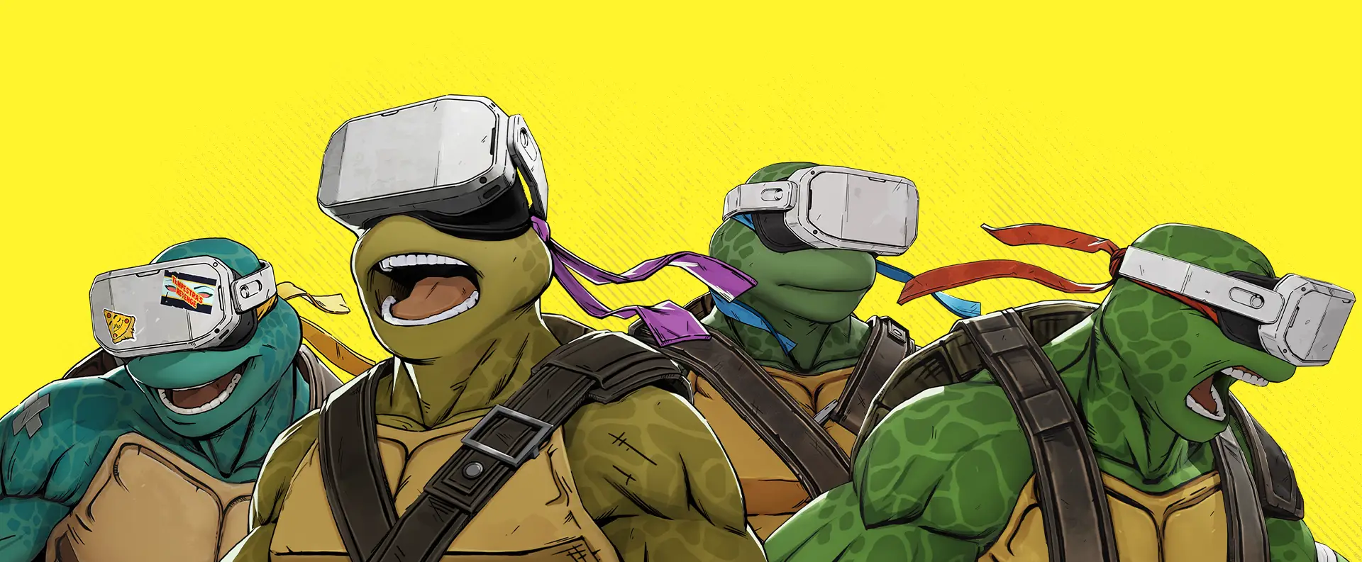
The identity extended across gameplay trailers, store assets, social content, trailer endplates, developer diaries, Deluxe Edition material, merch and community-facing campaign beats. The goal was to make the campaign feel consistent, recognizable and easy to adapt across channels.
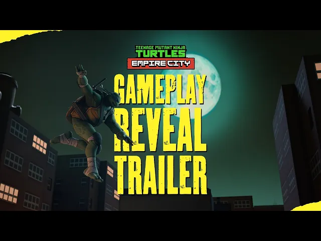
Gameplay trailer
The campaign identity carried into motion through trailer graphics and endplates.

Creative direction across stakeholders

The work moved between internal marketing, game production, external artists, Ronin DesignCo and Paramount/IP approval.

My role was to keep the creative direction clear, translate feedback and make sure the assets stayed useful across campaign production.

Takeaway

A darker game, made visible
The campaign identity translated the game’s darker VR atmosphere into a brighter, clearer visual system for storefronts, social media, trailers and campaign assets.

A flexible marketing system
The title treatment, typography, textures, key art and reusable assets were built to support production across formats, channels and campaign beats.

Creative direction at franchise scale
The project required balancing fan expectations, IP approval, external artists, internal stakeholders and practical campaign needs without losing the energy of the game.